Showing posts with label Sweden. Show all posts

Thursday, January 17, 2013

New logo: Eurovision Song Contest 2013

Image and video hosting by TinyPic

The Eurovision Song Contest, an annual televised singing competition with competitors from most European countries, was last year won by Sweden. As a result, this year's contest will be held in Malmö, a city in southern Sweden with about 300,000 inhabitants. Each contest has its own look and feel, and the visual identity – or theme art as the contest calls it – was unveiled today. It was developed by Happy F&B, a design agency in Gothenburg, Sweden.

The concept is called "the Butterfly Effect" – inspired by the idea that the flap of a butterfly can cause a hurricane on the other side of the planet – and has a colourful butterfly symbol at the heart of the identity. According to press reports, the symbol is about "togetherness, diversity and happiness". The two former values are expressed through the slogan "We Are One".
Read more »

Wednesday, December 19, 2012

New logo: Ving, Spies and Tjäreborg


European holiday giant Thomas Cook Group is using three primary brand for its travel operators in the Nordic countries; Ving in Norway and Sweden, Spies in Denmark and Tjäreborg in Finland. All three brands have histories going back to the 50s and enjoy strong positions in their respective markets. Today, it is launching a new visual identity with a common icon to be used by all three brands, created by Swedish design agency Happy F&B

From now on, all three brands will be represented by a glowing yellow and orange heart, nick-named "The Sunny Heart". The changes will also apply to the group hotel chains, Sunwing and Sunprime. Having a common visual identity allows both the travel operator and the hotels to be part of the same unified brand experience.
Read more »

Friday, December 14, 2012

New look: TV4


TV4 is Sweden's most watched commercial TV channel, founded in 1990. Yesterday, December 13, it introduced a new on-air graphics package.

The previous graphics package was introduced in September 2006 and has had a very long run. The idents featured presenters of TV4 programmes in a red backstage environment.

In the new look, TV4 reaches out into the Swedish reality. Different shots of Swedish landscapes have a cloud of dots in different shades of red flying through them. The dots are motif that TV4 has used in various forms for several years, and the new look was created as an evolution of that.

The new look was developed with broadcast agency Fireplace. Chimney Stockholm did post production and animation while music was composed by Magnus Frykberg and Gustaf Thörn.
Read more »

Tuesday, December 4, 2012

New logo: Lätt & Lagom


Lätt & Lagom is a Swedish brand of spreadable butter and vegetable oil, introduced in 1974 and manufactured by Arla Foods. This autumn, it has introduced a new package design.

The previous very modern design has been made a little bit friendlier with an image of sourdough bread on the packaging and a serif ampersand included in the logo.
Read more »

Thursday, September 20, 2012

New look: General


Snus is a moist powdered tobacco product, primarily consumed in Scandinavia. In Sweden, the most sold snus brand is called General and produced after a recipe made up in 1866. The brand now includes 14 different products, and recently they started introducing a new look, created by The Brand Union in Stockholm.

The new design creates a more unified look for the products carrying the General brand. Visual cues were taken from the brand's history.
Read more »

Monday, September 3, 2012

New logo: Annas


Annas is Sweden's leading producer of gingerbread cookies. Founded as a small bakery in 1929 by two sisters - one of whom was named Anna - it now exports gingerbead cookies around the world. Since 2008 it is owned by the Belgian bakery group Lotus Bakeries. Recently, Annas launched a new look on the domestic Swedish market.

Gingerbread cookies are a traditional treat associated with Christmas, and the new packaging emphasizes tradition with slightly darker colours and retro typography and decorations. The modern Annas logo clearly didn't fit into the new proposition and has been replaced by a more restrained wordmark and a portrait of Anna.
Read more »

Friday, August 24, 2012

New logo: Löfbergs


Löfbergs Lila is a Swedish family-owned coffee maker. Founded in 1906, it is today one of the larger coffee brands in the Swedish market. The name means "Löfberg's Purple" and is derived from its purple packaging. Recently, the company announced that it would drop "Lila" from its name and introduce an updated corporate identity.

Although no longer part of the name, the (literally) trademarked purple colour will still be featured prominently on the packaging. The logo has been redesigned with grotesque letters that look substantially different from the previous logo. Someone also felt that the logo needed to include a coffee bean in the letter Ö.
Read more »

Friday, August 3, 2012

New look: Malaco


Leaf is a European confectionery company with activites in Scandinavia, Benelux and Italy. Its portfolio includes several classic local brand that it has gathered after decades of mergers and acquistions. Recently, it has started introducing refreshed packaging for some of its classic Swedish candy brands, Zoo, Djungelvral, Fruxo, Gräddkola, Brio and PimPim, the oldest of which have existed for 80 years.

Until some years ago, they had maintained classic vintage label designs with only minor updates. These labels have a cult following and have been turned into a range of kitschy home furnishing details. A redesign in the 00s introduced a common design template and adopted Malaco as an umbrella brand, but many elements from the classic designs remained.

This more recent refresh is a more thorough redesign that gives up much of the old designs. It appears the company now wants to have a friendly mascot on the front of the package. Those brands that already had mascots have had them redesigned, and those that didn't have had new ones created. All are drawn in a similar cute style with wide-set cheeky eyes. The typeface used for the product name is Gothic 821 Condensed.
Read more »

Tuesday, July 10, 2012

New logo: Indiska (2011)


Indiska is a Swedish chain of stores that sell fashion and accessories designed with inspiration from India. Originally a single store opened in Stockholm in 1901, it started expanding into a nationwide chain in the 1970s.

For several decades it used a wordmark that drew clear inspiration from Hindi writing. Late last year, it introduced an updated logo that tones down the Indian typography a bit.
Read more »

Tuesday, June 12, 2012

New logo: Barnkanalen


Barnkanalen is the children's channel from Swedish state broadcaster Sveriges Television (SVT). The name literally means "the children's channel". Launched in 2002, it has grown to a position where its is by far the most watched TV channel among Swedish kids. Yesterday, June 11, it introduced a completely new look as it launched its summer programming.

SVT's four other channels got new look in March this year, created by New York motion design agency Trollbäck + Company. They were also involved in the new look for Barnkanalen. The new look employs a range of colours and patterns. This is partly because the new look needed to be versatile as the channel aims for both toddlers and 11 year olds. Idents featuring hosts from the channel were recorded in May.
Read more »

Monday, June 11, 2012

New logo: C More


The Canal+ name is used for major Scandinavian premium TV package, offering high-profile sports and first-run movies on several channels in Denmark, Finland, Norway and Sweden. Its name comes from the French Canal+ group who bought a group of premium movie channels called FilmNet in 1996, implementing its own name the following year. Canal+ eventually chose to divest from many of its international operations, and since 2003 the Scandinavian Canal+ and the French Canal+ Group have been completely separate.

Last week, on June 7, it was announced that the Scandinavian company would finally give up the Canal+ name to become C More (pronounced in English). The relaunch takes place on September 4. The name isn't completely new, the company behind Canal+ Scandinavia has been called C More Entertainment since it was separated from Canal+ France. It has also been used for film channels in the Canal+ package some years ago.

The official reason for the change is that the word "canal" (kanal means "channel" in Scandinavian) signals old-fashioned TV and doesn't reflect the new broadband offering. Another likely reason would be issues with continuing to license the name from its former owner. The logo above came with the announcement.
Read more »

Wednesday, May 2, 2012

New logo: Milda


Milda is a leading margarine brand in Sweden and Denmark, owned by Unilever who are the world's leading margarine manufacturer. This April, Milda started rolling out new packaging with an altered logo.

Unilever introduced a new look for Milda's sister brands in Germany and Benelux (Rama, Blue Band and Planta) a year ago. Created by Design Bridge in London, it did away with many local design characteristics for a new common design. Although billed as a "unified global brand identity", it has apparently not been applied to other countries.

The Milda redesign goes in a different direction. It does adopt the custom-made typeface created for Rama in 2011, but overall the new look takes inspiration from the Milda's history. The new logo once again includes a red oval and a flower. They had been a part of Milda's logo for a half century, but were removed in another global realignment in 2006.
Read more »

Thursday, April 26, 2012

New logo: Visita


The Swedish Hotel and Restaurant Association (Sveriges Hotell- och Restaurangföretagare, SHR), the employers' organization for hospitality and restaurants in Sweden, changed its name to Visita last Monday, April 23. The name was obviously inspired by the word "visit", which has positive connotations in both Swedish and English.

The corporate identity was developed by a Swedish design agency called Innovaform. In an interim period, the name will be flanked by the clarifier "Swedish Hospitality Industry" (or its Swedish equivalent).
Read more »

Monday, April 23, 2012

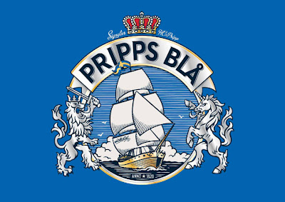
New logo: Pripps Blå


Pripps Blå is Sweden's largest beer brand, nowadays owned by Carlsberg. Recently, it introduced a new look, designed by the Swedish agency NINE.

Originally brewed by Pripps, a brewery founded in 1828, the brand itself was launched in the 1950s under the name Pripps Export. It took the name Pripps Blå in 1975, meaning "Pripp's Blue", based on the colour of its cans. Carlsberg bought the company in the year 2000.

The new look takes inspiration from the design used by Pripps Blå in the 70s and 80s, resurrecting the crest that was present on the cans during that time, but updating it to contemporary standards. The design wants to recognise the brand's history, while also communicating anticipation for the future.

Nine have also created what it describes as a "tattoo pattern", an extended graphic made to look like an engraving. With the crest at the center, it includes images that refer both to tradition and "dream of the future". It is used on some packaging, and elements of it can also be used separately.
Read more »

Thursday, April 12, 2012

New look: Findus Dagens


The frozen food maker Findus has gathered its ready-meals on the Swedish market under the sub-brand Findus Dagens (rougly meaning "Findus Today's"). Along with the new name, the packaging has been refreshed and the product itself has been refined with improved recipes.

The new brand and package design was created by Stockholm design agency Pond. Some examples of the new packaging can be seen below.
Read more »

Wednesday, April 4, 2012

New logo: Beckers


Beckers is a Swedish paint manufacturer, tracing its roots back to 1865, when a German opened a paint shop in Stockholm. For several decades, it has used a rainbow as its logo. At the beginning of April it was given a careful refresh. One colour (orange) has been removed, and the ones that remain are livelier. The name has been put below the rainbow, and the outlines have been removed.

The new logo was reportedly created by Swedish design agency BVD. Beckers claims the previous logo hadn't changed since 1967.
Read more »

Tuesday, April 3, 2012

More on: SVT


About a month ago, the Swedish state broadcaster SVT introduced new looks across four of its TV channels. The new graphics packages were commissioned from the New York agency Trollbäck + Company. Last week, Trollbäck posted montages of their work for SVT1, SVT2 and Kunskapskanalen, and they provided enough visuals to warrant a new post.

SVT1 employs a full range of bright colours and a 3D version of its logo. The more serious and specialist SVT2 uses orange and blue, exploiting the curves in the two numeral. The docuentary and information channel Kunskapskanalen also uses a full colour range, but with less bright tones.
Read more »

Monday, March 19, 2012

New logo: ATG


Horse racing is a fairly significant sport in Sweden. Gambling on this sport is managed by a company called Aktiebolaget Trav & Galopp (ATG, roughly translated as "Trot & Gallop Incorporated") which has a legal monopoly on this activity.

On March 9, ATG launched a new corporate identity, created by the Swedish agency Bold. Two custom typefaces were created with Pangea.

The logo retains much of the legacy from the previous mark, including the horse head and colour scheme, but gives them a more contemporary interpretation. The horse head has been further stylized to convey a sense of speed. The team has also applied a barrage of Illustrator effects.
Read more »

Tuesday, March 6, 2012

New look: Ramlösa

Before.
After.

Ramlösa is a Swedish brand of mineral water, bottled in Ramlösa in the southern part of the country. The well was founded in 1707, and the water has been available in its current bottled form for about a century. Today, the brand and the bottling plant are owned by Carlsberg.

Recently, Ramlösa introduced a new label design for its retail packaging for non-flavoured water, called "Ramlösa Original". The new label was designed by the Swedish agency Nine, which has done a lot of design work for Carlsberg, including Ramlösa's acclaimed premium packaging last year (read more about it at BP&O)

Ramlösa's retail packaging was last redesigned in 2007 by the British agency JDO, who helped reposition it to target "young unisex city inhabitants with a busy and active lifestyle". It was a relatively radical overhaul of a label that had only gone through incremental changes for a century, and faced harsh criticism from an ad man who had previously worked for Ramlösa, who said Ramlösa was imitating its competitors.

This time, Ramlösa has chosen a Swedish agency, and Nine seem to stress that this is a careful update. They also say the new label provides better contrast and a clearer hierarchy. The most noticable change is that the blue line pattern has been switched for a lively image of water.
Read more »

Friday, March 2, 2012

New logo: Kunskapskanalen


Kunskapskanalen ("The Knowledge Channel" in English) is a Swedish television channel dedicated to educational and factual programming, operated by the state television broadcaster SVT and the educational broadcaster UR. As part of a relaunch of SVT's channels next week, Kunskapskanalen will introduce a new look with a new logo.

The previous logo had been used since the channel launched in September 2004. It was inspired the Swedish artist Oscar Reutersvärd who pioneered the art of impossible objects.
Read more »