Friday, September 30, 2011

New logo: China Airlines


On Wednesday, it was announced that Taiwan's flag carrier China Airlines had joined the SkyTeam airline alliance.

China Airlines took the opportunity the reinvigorate its corporate identity. Although the plum blossom and the seal from the previous logo are essentially unaltered, there's a completely new typeface for the name, and the elements have been re-arranged in what is described as a "simple, harmonized and modern design".

Previous logo.

The current plum blossom was introduced in 1995, and the previous logo originated around that time as well. It replaced a complex symbol that had been used in various arrangements since the 1960s and included the CAL abbreviation, an aeroplane and a flower.
Read more »

New logo: Sportsnet


Yesterday, September 29, a new visual identity was unveiled for the Canadian sports networks currently operating under the Rogers Sportsnet name, which includes four regional TV networks and the national "Sportsnet One" TV network. The new look launches October 3 when the networks officially drop "Rogers" from their names to become just "Sportsnet". The recently acquired soccer channel Setanta Sports will be renamed Sportsnet World on the same day.

This is part of major push for the Sportsnet brand by its owners, Rogers Media, which has seen the brand expand into sports radio stations and a sports magazine.

The new identity was created by Sportsnet Creative Services and Troika Design Group. Special theme music was composed by Stephan Moccio and Nikki Yanofsky. All elements of the new identity are based on five brand attributes, "visceral, excellence, robust, engaging and Canadian".

Current Rogers Sportsnet logo.

The rebrand means the network is giving up its previous logo, including the peculiar symbol called "The Player" that has been with the network since the late 1990s.

The new logo is a straight-forward word-mark, with some sporty shapes cleverly underlining the initials S and N in the middle. The network's new slogan is "Fuelled By Fans", and the shapes are apparently called "fuel strokes" by management.

The underlined can be broken out and used separately, presumable for screen bugs and similar elements.
Read more »

New logo: AIS


Thailand's leading mobile phone operator AIS (Advanced Info Service) unveiled a new corporate identity this week. The new logo portray's a green smile, representing "friendship, creativity, growth and clear an steady expression".
"The great inspiration that results in AIS breakthrough in developing unprecedented service in advance of changing demand. In other word, voice of customers and Thai people resonates different demands in each period of time and life. The concept of new platform brand "Your World. Your Way." will enable AIS to support you to "Be more connected to close one in your own way," "Gain deeper connected," "Be joyful in your own way" and "Be inspired to build the future." - AIS executive vice president Somchai Lertsuttiwong
Green is the company's new signature color. Website and ads feature several green "waves" similar to the one in the logo.

Previous logo.
Read more »

Thursday, September 29, 2011

New logo: Virke


Yesterday, September 28, the Norwegian employers' organization HSH, which organises 15,000 businesses, many within the commerce and service industries, changed its name to Hovedorganisasjonen Virke. The new identity was developed by Brandlab Oslo over ten months.

The three-letter abbreviation HSH was generic as well as misguiding, as it was an abbreviation of a former name that contained "commerce" and "service", and the organization had expanded beyond those areas. It was scrapped for the more unique name Virke, which can be loosely translated as both "work" or "function". As Brandlab's case study explains, Virke wants to make the Norwegian work life work.

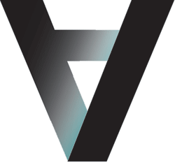
The new logo is a purple-pink wordmark designed to look unique and stand out. The odd V letterform is used as a separate visual device. In an interview with the Norwegian website Kampanje, designer Einar Hatlo says the colour was chosen to be both bold and politically neutral.

Previous logo.

The following images were published by Brandlab.
Read more »

New logo: Kortrijk


Yesterday, September 28, the city of Kortrijk in West Flanders, Belgium, unveiled a new visual identity.

The design was reportedly mostly done in-house. The logo is credited to a graphic designer named Yves Debaes. The new logo reflects the changes the city has gone through in recent years. Its shape represents houses, as the city "stands like a house" (a figure of speech meaning something is solid). Red has traditionally been Kortrijk's colour and is used in the new logo as well.

With a population of 75,000, Kortrijk is one of the twenty most populated cities in Belgium.

Previous logo.
Read more »

New logo: Kereta Api


The Indonesian state railway operator PT Kereta Api unveiled and launched a new corporate logo yesterday, September 28, as it celebrated its 66th anniversary.

The new logo features three arching lines, one blue and the two orange, with an arrow, the symbolism being more obvious than in its predecessor.

Previous logo.

The website Desain Grafis Indonesia has collected a bunch of Indonesian logos from the 1990s, including the logo grid for the Keretapi logo.

I can't read Indonesian, but it appears the new logo was selected through a contest. If any Indonesian readers can contribute more information, feel free to drop me a line in the comments section.

Kereta Api press release
Kereta Api
The Jakarta Post

Wednesday, September 28, 2011

New logo: Fédération Wallonie-Bruxelles


Yesterday, the government administration of the French community in Belgium unveiled a new logo as it is changing its name to Fédération Wallonie-Bruxelles. The namechange from "French Community of Belgium" to "Federation Wallonia-Brussels" was announced earlier this year, causing protests from Flemish nationalists as the Belgian capital Brussels is shared between the French and Flemish communities.

The new logo consists of a stylized interpretation of the initials W and B in red, yellow and blue. The offical colours for Wallonia are yellow and red, while they are blue and yellow for Brussels. Within the logo, red and blue represents the two regions, while the yellow "hyphen" represents some sort of unity ("our solidarity and the strength of our commitment").

Previous logo.

The previous logo included a rooster, a common symbol for Wallonia.

HLN.be
Nieuwsblad.be
RTLinfo
Fédération Wallonie-Brussels logo page
Culture.be

New logo: Asian Art Museum


Yesterday, September 27, the Asian Art Museum in San Francisco, launched a new brand identity at a press conference. It was created by Wolff Olins. The new look can already be seen on the museum's website.

The new logo consists of an upside-down letter A, usually flanked by the word Asian. In mathematics, an upside-down letter A is read as "for all", and the museum says it "communicates the museum's desire to engage all":
"We were attracted by the museum's ambitious vision and desire to build a brand to unlock the potential of its vast collection and thought leadership. Beyond visual expression, the new brand will transform the visitor experience over time to create new ways of connecting the collection and the community, ultimately leading to more visitors and support for its vision." - Wolff Olins strategy director Nick O'Flaherty in a press release
Previous logo.
Read more »

Tuesday, September 27, 2011

New logo: Velocity


Discovery Communications have started using an updated logo for Velocity, their upcoming network for "upscale men", with lots of programmes about motor vehicles, due to launch on October 4.

On April 14 this year, Discovery announced that they were replacing their dedicated high-definition channel HD Theater with Velocity. With this announcement came a logo, consisting of a silver-grey chevron and the name written in a Futura typeface.

Evidently, that was a temporary logo, because Discovery are now using a refreshed version. The chevron is still there, but has been remodeled, and also features a chrome globe.

The original Velocity logo from the announcement back in April.

Velocity announced its programming slate on September 19, and the logo at the top of this page could be seen on that announcement, although it may well have been used some time before that.

Discovery have managed to use at least four different logos for Velocity in the time between the announcement in April and the launch in October. In addition to the two already discussed in this article, there was one version of the April logo with an additional globe added inside the chevron and a different typeface, and Discovery have also posted promos with completely different logo consisting of a wordmark with a globe incorporated in the V. Hopefully, this has has been sorted out and settled by now.
Read more »

New logo: Bank al Etihad


Last week, on September 20, the Jordanian bank Union Bank revealed a new corporate identity. This saw the company adopt a new English brand name, Bank al Etihad, changing the English name from a translation to a transliteration of the Arabic name. The bank has also adopted a new slogan, "The Bright Choice".

Previous logo.

"Our corporate identity is inspired by Jordan; therefore, it’s driven by ambition, authenticity, and a rich ancient civilization that evolved into a unique modern setting. As for our slogan, it is drawn from Jordan’s nature and exquisite geographical formations; sand dunes in Wadi Rum, Amman’s seven mountains, and the seven-pointed star that makes our flag special, and stands for its pride.

Our new logo is also a symbol of our story; or rather a seal and a stamp of confidence. Our identity is driven by Jordan’s people, and their warm family ties. It’s a new day and an important stage to renew our commitments to clients, and promise a brighter future…hence the slogan: the Bright Choice.
" - Nadia Al Saeed, Bank al Etihad general manager
AMEinfo
Bank al Etihad news article

Monday, September 26, 2011

New logo: Paris Première


Paris Première, one of the most popular cable/satellite channels in France, seems about to introduce a new visual identity. An updated logo could be spotted in various press materials last week, including the press kit sent out to advertise its programmes in the upcoming television season. It appears Paris Première are yet to launch the new logo on their website or on screen.

One of the first cable channels in France, Paris Première started broadcasting in 1986 as a local channel in Paris. Since then it has expanded into a national channel on cable, satellite and digital terrestrial. Its owners, M6, are currently lobbying authorities to allow it to broadcast free-of-charge to all of France. From the start it has had an upscale, metropolitan and cultural profile, which it continues to uphold as it celebrates its 25th anniversary.

Previous logo.
 
The previous logo was introduced in 1990s and designed by the French broadcast design agency Gédéon.

Other than the typeface, the new logo is essentially the same as its predecessor. The refreshed logo uses Neville Brody's Typeface Six and Seven family.
Read more »

New logo: C Spire Wireless


Today, the American wireless communications company Cellular South is rebranded as C Spire Wireless. The rebrand was announced last Thursday, September 22.

Reports says that the 'C' stands for 'consumer', and that the name also includes the word 'inspire'. The new symbol for the company is a C with a bunch of spires spouting out from it.

Previous logo.

The previous logo was introduced around 2006 as a modernization of an earlier mark.
Read more »

New logo: Azucarera


Azucarera is Spain's leading sugar producer and is nowadays owned by AB Sugar, a division of Associated British Foods. Last Thursday, September 22, the company announced a new visual identity, created by the Spanish design agency La Cía.

The new logo is a friendly rounded wordmark that retains the historical red and orange colours, conveying "a sense of sweetness and well-being". It also includes a new slogan, which translates as "Life tastes better".

Previous logo.

Read more »

Friday, September 23, 2011

New look: BBC Entertainment


BBC Entertainment is an international TV channel brand from BBC Worldwide, the commercial arm of the British Broadcasting Corporation, and is available in many countries in Asia, Europe, the Middle East, Africa and Latin America where it is BBC's primary channel for drama, entertainment and comedy. Yesterday, a new identity for the channel was unveiled, created by the UK design agency Heavenly.

Heavenly created five idents based on dance, "an activity that provides entertainment the world over and has many distinct, diverse regionalised guises". Named "Electric", "Elegant", "Free", "Lively" and "Upbeat", the idents are based on real dancers in various disciplines that have been motion-captured and turned into abstract figures in an eclectic CGI environment. The idents start with scattered the crystal shards that come together as a dancing figures. Each ident has a unique score that sets different moods.

Previous logo.

Two agencies have previously produced graphics packages for BBC Entertainment. Bruce Dunlop & Associates created the original idents in a short timeframe for the channel launch in 2006. Later on, in 2008, Dunning Eley Jones created a new set of idents featuring water fountains.

Some snapshots of the new idents can be seen below. A compilation of the new idents is available here.
Read more »

New logo: Royal Conservatoire of Scotland


On September 1, the Royal Scottish Academy of Music and Drama (RSAMD) officially changed its name to the Royal Conservatoire of Scotland, a change with years in the making. The visual identity was created by the Stand in Glasgow who won the assignment in a four-way pitch. It is centered on a mark where bars make up the initials of the institution, signifying its diversity and representing its disciplines. The typeface for the logo-type was costum-made.

Previous logo.

The previous logo, a nice mix of typefaces, was introduced a few years. It replaced another, more colourful, logo introduced about a decade ago.
Read more »

Thursday, September 22, 2011

New logo: Cigna


The Connecticut-based health services company Cigna launched a rebrand campaign on Monday, September 19, as it changes its business model to focus less on corporations and more on consumers in a changing healthcare market. This includes giving up its 18-year-old "Tree of Life" logo for a pictogram where the the costumer is literally in the center.

Although Cigna have provided the full color version seen above, they seem to use single colour versions extensively as well.

Cigna's previous logo, used from 1993.

The "Tree of Life" design was presented in 1993, created at Landor Associates in San Francisco under the leadership of Lindon Leader. The reasoning behind the 1993 rebrand shared some similarities with the current, as it was thought at the time that Cigna's original logo didn't convey "care" properly. This rebrand also brought the entire company together under one symbol. The "Tree of Life" on a softened teal square was based on a New England quilt from the 18th century.
Read more »

New logo: I Can't Believe It's Not Butter!


Unilever's butter substitute I Can't Believe It's Not Butter! made a very slight logo update around the beginning of this year. The changes in typefaces and decorations propably passed by without much notice from most costumers, the most obvious change being the enlarged exclamation mark.

The previous logo was introduced some time around 2006 as part of a more substantial redesign.

Previous logo.

The changes only apply to the American markets. ICBINB is also available in the UK market, but with a different design.
Read more »

Wednesday, September 21, 2011

New logo: StudioCanal


At the beginning of September, the France-based movie studio StudioCanal gave up the local names of its subsidiaries in Germany and the United Kingdom, Kinowelt and Optimum Releasing, instead renaming them both after their parent company. With this came a new visual identity, including a new logo and a brand new intro, both created by the UK agency Devilfish.


The new identity replaced both the identities of Optimum and Kinowelt, as well as the existing StudioCanal identity, including its "dramatic clouds" intro.

Previous logo.

The logo has been known at least since June 30, when the rebrand was announced, and the intro was unveiled in early September. It was first used in the Tomas Alfredson-directed movie Tinker Tailor Solider Spy, which had its UK-wide premiere on September 16.


The new intro is an evocate piece featuring light projected through glass panels, produced with Double G Studios. Harris Zambarloukos acted as director of photography and a mood-setting musical score was composed by Alexandre Desplat.
"In order to create something truly timeless, we began with the concept of the interplay between light and glass. Light is the common denominator of all cinema; a movie is simply the record of light on film. And the glass in the lens of both the camera and the projector is an essential tool in the making of movies.
A large installation of 25 glass panels was built (representing STUDIOCANAL’s vast library of films), and abstract light generated from STUDIOCANAL titles was then projected through the glass panels.
We crafted as much of the ident in camera as possible, keeping post-production to a minimum – creating a sequence that could conceivably have been shot at any time in the history of film-making.
" - Devilfish
Read more »

Tuesday, September 20, 2011

New logo: Nextel / NII


The Virginia-based company NII Holdings, which operates mobile telecommunication services in Mexico, Peru, Chile, Argentina and Brazil under the Nextel name, launched a new corporate identity yesterday, September 19. This involves new marks for both NII and the local Nextel subsidiaries.

The new brand identity was developed by Landor Associates in San Francisco.

NII and the Nextel sudsidiaries are now now linked through several visual aspcets, including a common typeface, the orange typeface, and the enhanced 'x'. The 'x' is a part of both new logos, but can also be used as a separate device, a "connector". The connectors are "meant to join ideas or focus attention".

Previous logo.
"Orange was selected as the dominant color for the new logo for its freshness and appeal, while a proprietary font was chosen to lend a contemporary feel. The NII Holdings, Inc. logo will change its design and color to coordinate better with the new Nextel brand graphic identity that will be used in the company’s markets." - NII press release
Read more »

New logo: Canalsat


France's leading satellite TV platform, Canalsat, has introduced a new colourful logo, an irregular colour band, ranging from grey to blue to pink, representing diversity and openness. The typeface has been used by Canalsat and its associated businesses have used since 1984, when Canal+ was founded.

French media are reporting that the new logo was created by Nude, who will also support the deployment of the new identity.

Previous logo.

The previous logo, including its globe, was probably introduced in 2009. There was also a simplified version of this logo that only featured the grey rectangle.

Before 2009, the brand identity of Canalsat, Canal+ and associated businesses was the responsibility of the French graphic designer Étienne Robial.
Read more »

Monday, September 19, 2011

New logo: Telstra


Last week, we could read that the Russian telecom operator Rostelecom was introducing a new logo featuring several bright colour combinations in an attempt to appear sensitive, warm and focused on people. At about the same time, on the other side of the globe, the Australian telecom company Telstra launched a rebrand campaign that uses bright colours to deliver a similar message.


However, Telstra are not introducing a completely new logo. Instead, they are giving a new lick of paint to the old one. Or rather six different licks of paint, as their "T-falling-into-a-hole" icon is now available with different colour combinations, instead of the orange-blue combination it has used until now. The six colour combinations are orange, green, turquoise, blue, purple and magenta, and will be used for both the logo and new graphical devices as part of a new visual language.

The new brand identity was developed by Interbrand.

Telstra have provided an exciting rebrand video that should provide more context:


The Telstra logo dates back to the 1990s. Initially the stem of the T was invisible, but that was altered some years ago. In more recent years, Telstra have mostly used the T-and-oval part alone.

Previous Telstra logo.

Telstra logo from the 1990s.
Some examples of the new brand identity can be seen below, after the jump.
Read more »

New logo: Onet.pl


Onet.pl is a popular Polish web portal. Last week, it announced a new site design, which included an updated logo. Onet worked with the Polish branch of Dragon Rouge to develop the new look.

The previous logo had been used by the portal for over a decade. The new logo is lighter and drops the "pl" part, but keeps the dot. The colour of the dot now changes depending on what section of the site one visits. The site also features decorations made up of multi-coloured dots, represting the variety of content found on the site.

Previous logo.
Read more »

New logo: Yammix


Yammix is a new Romanian brand of flour mixes manufactured by the flour company Şapte Spice, a division of the Vel Pitar group. The brand strategy and design was developed by the Romanian brand consultancy BrandTailors.

According to BrandTailors, bread mixes made for use in bread machines are an unknown product category in Romania, so the challenge was not only to launch a new brand, but a new kind of product.

The brand platform was built around the ease and convenience of baking bread with flour mixes and bread machinse - which is almost magical compared to preparing the ingredients yourself. The package design aims at making the products stand out in the flour category, featuring shots of finished breads and hand drawns figures in flour.
Read more »

Friday, September 16, 2011

New logo: Rostelecom


Russia's leading provide of long-distance telephony, Rostelecom (Ростелеком), unveiled its new corporate identity at a press conference yesterday, September 15.

The new identity was developed by TNC.Brands.Ads, with the Russian branch of Leo Burnett credited as a participant.

Previous logo.

Although Rostelecom is a company founded on high-tech products, it serves actual people, and wants its brand to perceived as "modern, bright, warm, sensitive and Russian".

The new symbol for the company can bee seen as an interpretation of an ear as well as of the Cyrillic letter Р, the first letter in the name of the company and the country where it operates. The dark blue colour of the previous identity is replaced by brighter gradients. The main corporate version of the symbol is blue and orange, but there are a bunch of colour variations that represent different services.
Image and video hosting by TinyPic
Although the offical revealing took place yesterday, it has been known that Rostelecom was about to rebrand since last spring, and the "ear" symbol had already been previewed on billboards around St. Petersburg for a couple of weeks.

A bunch of examples of the new identiy can be seen below, after the jump.
Read more »